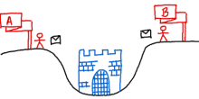
Have you ever wondered what makes a video go viral? Or how it is possible that they can spread so quickly? Maybe you didn't (that's fine), but many economists, marketeers, and even mathematicians have wondered.
Or have you ever wondered how it is possible that an infectious disease like the flu, Zika, or Ebola can spread across continents in a matter of days? And what can be done to stop them or slow them down? Maybe you didn't (not a problem), but many doctors, epidemiologists, economists, --and again those mathematicians-- all have wondered. About this one a lot.
In this article I will discuss what mathematicians discovered about viral videos and epidemics: namely, that they're amazingly similar. And that we know the reason why.
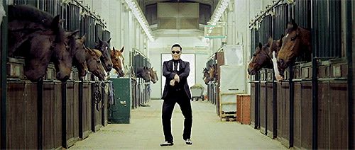
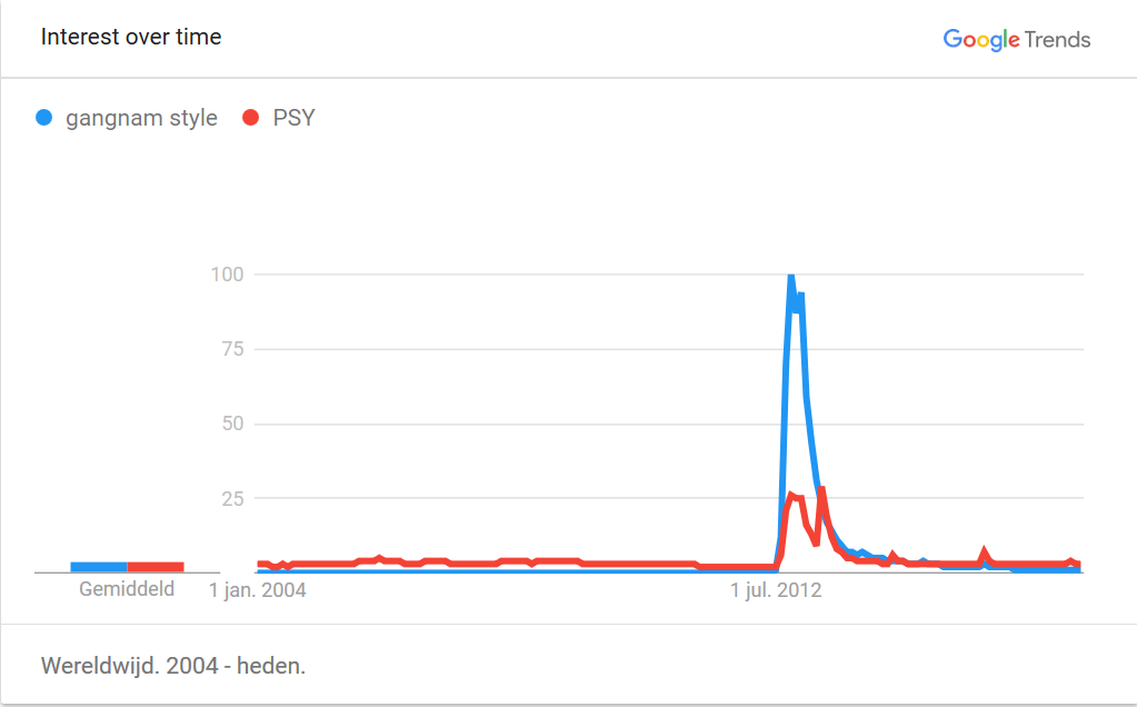
Let's start by having a look at memes and viral videos. You can check out the website knowyourmeme.com, where memes, including their origin and spreading history are carefully researched, or the Wikipedia page List of most viewed YouTube videos (Wikipedia). Take for instance the top hit, the Gangnam style video by PSY, that was uploaded to YouTube on July 15th, 2012. The Search interest chart
shows that the video started to become popular around July 2012 and gained its full popularity three to five months later, between October and December 2012. On the 21st of December the video was the first to ever reach one billion views! To accommodate the video's popularity, YouTube even had to adjust its view counter from a 32-bit description to a 64-bit description. This allows now the counter to go up to views instead of to that was the maximally possible before Gangnam style. You can look at a short video on this at What Is The Highest Possible Number of Views a YouTube Video Can Get?
After December 2012 the interest in Gangnam Style started to drop, but it still garnered another billion views over the next half year. Today it has 2.79 billion views.
Now let's take another meme, Slenderman@Know your meme, which also went viral around the same time. Search interest in Slender Man has a similar pattern as Gagnam Style: a sharp peak around the time it went viral and then a more gradual drop in interest later on. It might not surprise you that this pattern is very typical: people pick up on new trends quickly and for a few days `the world's eye' is on the same video. After the novelty fades the interest gradually decreases.
But here is an entirely different topic: the spread of infectious diseases in large populations. Many people who study infectious diseases would like to understand how an epidemic starts, or when disease become a pandemic (a very bad epidemic, where the disease infects a very large part of the population). More importantly, they would like to know how the number of infections could be reduced, and how we can prevent a large outbreak from happening.
By analysing previous pandemics, we can gain some information on the way they spread. Imagine you have gathered some data about an epidemic (say, the flu that made you cough this winter). The most basic statistical analysis that you can do with your data is just to look at the number of newly infected people and plot it against time. This diagram is called the epidemic curve. The epidemic curve of a flu pandemic in China can be seen here:
Epidemic curve of laboratory-confirmed pandemic 2009-H1N1 influenza A cases and deaths by week, South Africa, as of December 15, 2009, taken from www.nap.edu
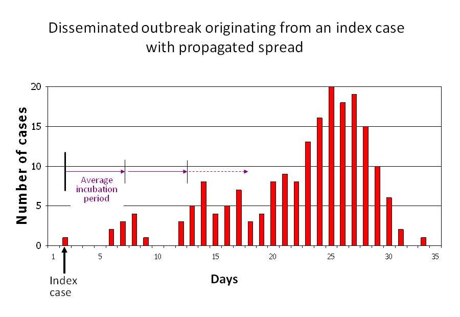
The first thing that you can notice when you compare your epidemic curve to this one, that they look surprisingly similar! You would argue that a flu is just a flu and it is not so surprising that they look similar. You might become a bit more puzzled if you compare the epidemic curve of some other disease to this one:
Infectious disease pattern of a person-to-person spread disease. Taken from med.uottawa.ca
The surprising thing is, that these curves look similar to the meme popularities! What causes these similarities, and what are the differences? How is it even possible, that a video can become known to basically the whole world within just a few weeks? What makes epidemic outbreaks similar to the spread of a video?
It might of course be a coincidence that the curves look the same, but actually, it's not. (The fact that we call them viral videos is a clear hint at this.) We can understand that they should look the same if we analyze both problems using networks!
By thinking a bit about it, you might notice that in both the spread of memes and diseases, there is an underlying network formed by the connections between people. These connections can be online connections (friendships on Facebook, followers on Twitter) in the case of videos or memes, or physical connections (classmates, collegues, friends, family members coughing on each other) in the case of disease spread. And, generally, a video, meme or disease spreads on the underlying network by people transmitting it to their acquaintances. There are exceptions of course, when for instance a meme is posted on a news website and a lot of people read it at once: but hey, then we can just add the news website as part of the network and making their readers connected to it. Nevertheless, there is an underlying network that supports the spread, and this underlying network is what makes the world so connected. And not just connected, but connected in a way that explains the extreme fast spread.
Let's fantasize a bit how a video could spread on an online network! Imagine now that you have made a video and you share it with ten of your friends. If they share it with ten of their friends, and those with theirs, (and all those friends would be different), then in ten steps you would cover people, that is, 10 billion people! You might argue that the friends of your friends are very likely to overlap, plus, they would not necessarily share your video with ten friends, or even at all. These are relevant issues that need to be taken into account. The process is clearly way more complicated than this little fantasy experiment. To better understand how a viral video spreads, we need a more realistic way of describing how a video can spread on a network.
Modeling: generating a random network.
Now we are in the territory of modeling. We need a model that on the one hand realistically mimics the network and the spread of the video on it, while on the other hand it is simple enough that we can understand it well enough to predict an epidemic curve. A mathematician's favorite model for a network is called a graph. In our case, the graph models the network by letting the people in the network be represented by vertices (nodes) while their connections (friendships, online followers, etc) are represented by edges (lines connecting two nodes). We usually draw a graph by drawing the vertices as points or tiny circles and the connecting edges as nicely curved lines, see for instance a Twitter network represented as a graph here in the figure below:
Connections among the Twitter users who tweeted the word bigdata when queried on February 27, 2012. Taken from Marc Smith on Flickr.
Since we would like to model viral spread on huge networks with billions of people, we need a large graph model as well. The model that we will consider was invented in the eighties, but is still one of the best ones we know for modelling large networks.
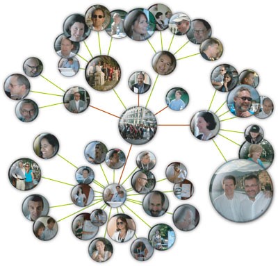
A network solution by A Henney & G. Superti-Furga, Nature 455
It's called the configuration model, and was invented by the Hungarian combinatorialist Béla Bollobás. Originally, he invented the model to help him with an abstract math problem: to count the number of graphs with a hundred vertices that all connect to three edges, say. But, the model grew far beyond its original purpose, since it was very easy to modify it to mimic real-life networks such as Facebook or Twitter. The configuration model captures one aspect of a real network: the number of connections each person has. To see how it does this, let's start by imagining that we are drawing the network of all real-world social interactions between all people in the world:
Imagine that you would like to map the connections (acquaintances) between all the people in the world. Even if this would somehow be possible, it would clearly take an insane amount of time to do this, and come at an enormous cost!
But still, we want to know how the epidemic curve works, so we decide to cut some corners, and hope it won't matter too much for the end result. To spare time and cost, instead of asking everyone who they know, we can ask only how many people they know. Let's call the total number of acquaintances of a person the degree of the person from now on. We can then generate an (artificial) network randomly with the same degree for each vertex as its true degree: we connect each person (vertex) to precisely how many people they know, but we don't care who those people are. Instead, we just pick some at random. This is precisely what the configuration model does. We can then hope that the main characteristics of the randomly generated network resembles the original one enough that it is hard to tell the difference between the real network and the random one. If that is the case, we might believe, then a video like Gangnam style should also go viral on the generated network.
It is of course still a ridiculous task to try and find out how many acquaintances every single person on this planet has (who even knows this of themselves?). But before we continue with that problem, let me first explain how to generate the network randomly if we would know the degrees of all the people in the world. That is, how the configuration model works. Simply put, it is actually going to happen in the easiest way possible. For each vertex of the network you draw as many little stubs as the degree of that person. You can think of these stubs as half of the edges that are going to connect vertices. Sometimes mathematicians even call them half-edges, but let us just stick to calling them stubs. Once you have drawn the right number of stubs to each vertex, you can start forming edges.
This is where randomness comes in the picture. The rule is, that you have to choose two of the stubs completely randomly and match them to form an edge. By completely randomly I mean here that every possible pair has an equal chance to be picked. Once the first chosen pair of stubs forms an edge, you choose the next pair of stubs again randomly from the rest. And so on, until all the stubs are gone and your network is formed. A computer can be programmed to do this random pairing pretty fast. Have a look at this pairing is shown in this simulation:
The generated graph is called the configuration model. It is a random graph that keeps the degrees that you wanted, yet it has as much randomness in it as possible. It is not a perfect model. For instance, it might occur -- mostly between vertices with very large degree, called hubs -- that the model generates more than one edge between two vertices. Or even worse, two stubs attached to the same vertex can be paired to each other, forming a so-called loop! These make absolutely no sense in real life: no one is a friend of somebody twice, or shares a video with herself! Maybe some old people do...? Joking aside, the generated network is not perfect, but these issues -- multiple connections, loops at vertices -- are basically harmless, since they are so rare that you would probably never notice them in a large generated network!
If you play around with the simulation a bit you can see a couple things: Even though the degrees are similar, the simulation produces a different network every time it is restarted. This is of course due to the randomness in the pairing procedure. Yet, if you increase the number of vertices to quite high (300 is enough) then the networks that are generated are different on the vertex level, yet, looked at from above, they look similar all the time. This gives you the hope that even though the real network is unique, the generated networks will be able to model it quite well.
Modeling: degree statistics.
Speaking of money and time again: to model the true network, we spared a lot by asking for only the total number of acquaintances per person. But, this is still an enormous task for six billion people! Can we come up with something better still? The answer is yes, and the solution can be found via basic statistics.
With a limited budget and time on hand, we just ask a large but affordable number of persons how many acquaintances they have. That is, we take a sampling of the population. This is a common procedure, for instance when making predictions for elections. We have to be a bit clever and determine who we ask (include in the sample) in a clever way, so that the sample is representative of the whole populations. For instance, picking only three-year-olds or only movie stars is probably not a good idea. The sample has to be a good cross-section of society.
Once we have the sample, we look at the degree statistics in this sample and extrapolate the rest of the degrees from there. We, mathematicians, do the extrapolations in the following way:
The degrees in a network (in a populations) can be summarized by a function that describes the proportion of vertices (people) that have a certain degree. Thus, in the sample group we write down the percentage of people who have degree zero, one, two, , a hundred, a hundred and one, , two hundred, , and so on, for each possible value for the degree. This gives us a function, which we call the degree distribution. Then we assume that our sample group was a good representation of the whole population, and that the same function is valid for the whole population, not just for the sample group.
Then, we can we use a computer to randomly generate the degrees for the whole population as well, using the degree distribution that we measured on the sample group, so that the percentages of the randomly generated degrees match those of our statistical sample. Programmers know how to do this very quickly, and by quickly I mean within milliseconds! This way we can quickly and cheaply generate a random network that hopefully still has the same basic features than the original one.
Scientists figured this out already long ago, and have taken many samples the degree distribution of human populations. And they didn't stop there: besides analysing the degree distribution of human populations, they also sampled the degree distribution of many other networks, such as the internet router network, the World Wide Web, Twitter networks, the Facebook network, brain activity networks, gene networks, food-chain networks (which animal eats which other animal or plant), airport networks, electricity networks, and many many more.
And what they found is absolutely intriguing. They found that, surprisingly, many networks in real life have basically the same degree distribution function!
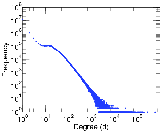
Again, if you take the proportion of vertices in the network that have degree , and plot this as a function, you get a dot for each degree. If try to fit a continuous function to the dots, you will notice that a function like fits the best in many cases. Sometimes you would find the best fit to be , or and so on, with different numbers in the exponent of , but it is always a function that is ``one over to the something''. Most often it's like that. Sometimes, not often, an exponential function like fits better. But never a logarithm, or a sine, or any other function you learned about.
This particular degree distribution () has popped up in so many cases that it has a name. We call it the power-law function. The ``something'' here is very important. It too has a name: it is called the power-law exponent. Power-law degree distributions are observed in the internet.
A log-plot of the proportion of degree of routers in the internet. Taken from here by Latapy, et al (2015).
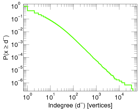
on the WWW (between webpages linking to each other), on Twitter
A log-log-plot of the proportion of twitter users that have been cited by other twitter users at least a given number of times. Taken from here.
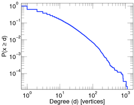
in ecological networks, (where, for instance, vertices are plant species and animals, and a connections is made when the animal eats the plant), in neural networks (your neurons in your brain also form a big network!) friendship networks
A log-log-plot of the proportion of people with at least a given number of contact in the brightbite social network.
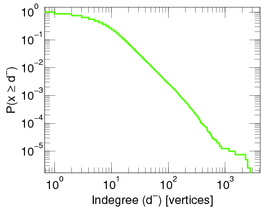
and in many other cases. On the pictures you see a straight decreasing line, since the plots are log-log plots, where the scale of the axes are logarithmic. Seeing a straight line on a log-log plot is the ultimate evidence that the function is a power-law. And the slope of the line corresponds to the exponent. The degree distribution of many networks are plotted here Degree distributions@Konect-Uni-Koblenz. By clicking on the link under a distribution plot, the network is explained in more detail.
The fact that power-law degrees are so abundant in networks is very intriguing and many scientist have given a hard thought on explaining the reasons for it. Nowadays, we think we know why this happens, but the explanation is far from easy, so let's save that story for another time!
What is more important for explaining the quick spread of Gangnam style is the precise value of the power-law exponent. Note that many of the above mentioned networks have an exponent between two and three: for the Twitter network it is 2.86, for the core internet it is 2.1, for the social network Brightkite it is 2.48.
products bought by the same persons on Amazon
Links between Wikipedia articles
Nouns used in the bible, nouns are connected if they are used in the same verse.
So if we want to model these real life networks, we can model the underlying network of people by computer-generating a random network (using the configuration model). We computer-generate the degrees of the vertices from a power law distribution, where the exponent is somewhere between and .
A visualision of the generated network can be seen on Figure .... You can play around with it by changing the exponent of the power law while keeping the number of vertices fixed. Take the number of vertices to be 500 and start decreasing the exponent from 5 to 2 gradually. What you can notice is that as you decrease the exponent, vertices with larger and larger degree start to appear. The graph structurally looks like a nice spread-out web as long as your exponent is above . However, once you cross 3 and you have the exponent at 2.9, 2.8, and so on, the network collapses. By ``collapses'' I mean that large-degree vertices tend to be clustered together in the middle, forming a very well connected core. While most vertices have degree 2 or 3, these are hanging off from the core on short paths. The distance (number of ``hops'' between vertices) to go from one part of the network to another part just became much much shorter!
To use this demonstration on your full screen click here
Modeling viral spread.
Now that we have a network model, we are able to model how Gangnam style spreads on the network. Suppose that someone has a video and we would like to see how long it takes to spread to some other person far away in the network. We can model this by seeing how a video would spread on the computer generated network. This is called running a simulation, since we simulate the true process (Gangnam style spreading on Facebook) by an imaginary video spreading on a computer generated network. When we want to do this simulation reasonably, we need to figure out how long we should wait in the simulation to forward the video from one vertex to another in the generated network.
Again, we have to make a lot of simplifying assumptions. It is quite natural to assume that after a person posts Gangnam style on his Facebook wall or shares it on Twitter, then his Facebook friends or Twitter followers read and re-share or retweet this post at different times, if at all. Since we do not really know when or how they will do this, we can again do some statistical analysis on the time it takes for re-sharing/retweeting. As before with the degrees, we can again take a representative sample of people who post/share videos, and see how long it takes for their followers to share the video again. When we plot the proportion of followers who share within 1 hour, 2 hours, , a day, etc, we obtain another distribution, the transmission time distribution.
We now make the usual simplifying assumption and say that the transmission distribution that we have found is generally valid through the whole network, and we can just computer-generate transmission times for each transmission that happens on the generated network. In terms of the modeling, we can represent the transmission times as numbers written on the edges. For example, if you see the number 3.4 on an edge that connects Anna to Beatrix, that means that if Anna posts the imaginary video at some point in time, it will take an additional 3.4 hours for her follower Beatrix to read and re-share the video. The good thing about this representation is that it is very simple. A computer can generate the transmission time for each edge from the transmission time distribution within milliseconds!
Extremely fast spread
Now we have the simulation for the video to spread: we have the network generated by a computer and we model the transmission times by allocating random numbers to each edge.
Finally then, it's time to see how long it takes for the video to cover a large part of the network. But before we do, I have one final confession to make. In my story I made it seem like the computer simulation was a very important part of the process. But actually, it is not. The amazing thing is that we can calculate the epidemic curve precisely, by using Probability Theory. Using this kind of math, you actually don't need to simulate anything on a computer at all. Some computations with pen and paper will give us the same answer! Actually, the mathematical answer is often even much better: using math we can, as it were, do all possible simulations at the same time.
Using math, what Remco van der Hofstad, Enrico Baroni and myself have shown is the following, very surprising phenomenon:
The time for the video to cover a large proportion of the whole network does not grow with the size of the network!
You could do your simulation on a network with 500, 5000, 5 million, 5 billion, and so on, arbitrarily large number of vertices, and see how long it takes for the imaginary video to cover 90% of the network, say. Of course, one measurement is no measurement, so you should re-run your simulation on the same size of network maybe a thousand times. Then you can do some basic statistics again, to see how many times out of thousand your video covered the network within one day, two days, three days, etc. This way you get yet another function, that we call the distribution of the 90\% coverage time.
What you will notice is that no matter how much you increase the size of the network, the statistical diagram that you obtain basically remains the same. In fact, it will stabilize at a curve that very much looks the same as the Gangnam style search interest curve or as the epidemic curves at the beginning of the post. If you give as an input the degree distribution that you used to generate your network, and the transmission time distribution to simulate the spread of the video on it, it is actually not hard to calculate mathematically what the stabilized curve will look like.
The main message though is not really the shape of the curve, but the surprising fact that the cover time does not grow as you increase the size of the network! So by the same time that 90% of the people in a village have seen the viral video, 90% of the entire world will have seen it too!
Basically, this provides a mathematical explanation for how it is possible that videos like Gangnam style and epidemics like the flu can spread so quickly.
Understanding the reasons of fast spreading is of course nice but in itself not very useful. Yet it opens up the door to many applications. By understanding how a virus or viral video spreads, and which vertices play a crucial role in the spreading, we can also hopefully interact with the spreading process: in the future we will be able to prevent the spread of horrible viruses like ebola or zika much more efficiently, for instance by vaccinating first the superspreaders (the extremely well connected vertices) in the network. Or, you can try to maximise the effect of an advertisement (with limited costs) by carefully selecting the people who are most likely to be superspreaders of such things. Or, for a more fun application, you can try to make your own video go viral by sharing with your most well-connected friends.
Network science is still in its early stages, so there are plenty more applications and phenomena to discover.
Prof. dr. ir. Hans Heesterbeek, one of the leading infectious disease epidemiologists in the Netherlands, is a busy man. Fortunately for us, Hans Heesterbeek had a gap in his schedule to yet again answer some questions, this time not asked by professional journalists, but by us, four students from the Technical University in Eindhoven.
In February 2014, a big bank in the Netherlands suffered from an internet banking malfunction which led many costumers to accidentally perform duplicate bank transfers.
A mathematician once told me that problems that are very simple to state can be very deceiving, and sometimes turn out to be extremely difficult to solve. One such problem was the Four Color Problem.
How can one hope to understand the precise structure of a virus if it is able to become unrecognizable within weeks? The mathematics behind this questions didn't let go of my mind for extensive periods of time during my PhD studies in Belgium.
In times of war, secure communication can be the difference between life and death, or even winning or losing a war. The first to patent a rotor machine in Europe was Arthur Scherbius in 1918. Scherbius’ version of the rotor machine became a commercial success, unlike the other patented machines. Scherbius named his machine Enigma.
 views instead of to
  that was the maximally possible before Gangnam style. You can look at a short video on this at What Is The Highest Possible Number of Views a YouTube Video Can Get?
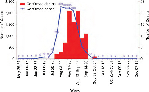
 people, that is, 10 billion people! You might argue that the friends of your friends are very likely to overlap, plus, they would not necessarily share your video with ten friends, or even at all. These are relevant issues that need to be taken into account. The process is clearly way more complicated than this little fantasy experiment. To better understand how a viral video spreads, we need a more realistic way of describing how a video can spread on a network.
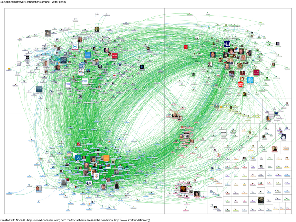
 , a hundred, a hundred and one,
  , and plot this as a function, you get a dot for each degree. If try to fit a continuous function to the dots, you will notice that a function like
  fits the best in many cases. Sometimes you would find the best fit to be
  , or
, or  and so on, with different numbers in the exponent of
  , but it is always a function that is ``one over
  fits better. But never a logarithm, or a sine, or any other function you learned about.
 ) has popped up in so many cases that it has a name. We call it the power-law function. The ``something'' here is very important. It too has a name: it is called the power-law exponent. Power-law degree distributions are observed in the internet.
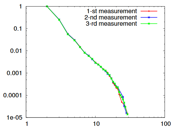
 and
and  .
.